
Since Google gave an advantage to responsive web design in terms of SEO, the web design was completely transformed into responsive web design by default. From years, we have been building responsive web designs and know them of web designs which are functionally and visually sound when accessed on a variety of devices and screen sizes.
As of today, we are used to building our website for different mobiles, desktops, tablets and check how they respond to these devices’ screen sizes, hence the name “Responsive”. But that will not be the case forever. Responsive Web Design is evolving aggressively with the devices having different viewports and screen resolutions being added every day and with the advancements taking place in technology.
Earlier who’d have known about foldable screens and making their web design compatible and responsive with these foldable screens and devices? But today, it is no longer a dream. This is just an example, we have various trends and future technologies coming up which will completely change the way we look at responsive web design. Let’s have a look, what are the trends that are going to dominate responsive web design in the near future.
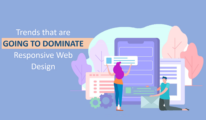
Trends in Responsive Web Design
Foldable Screens are a new buzz
With Samsung’s announcement of foldable screens, the whole tech world went crazy! We never thought of something as foldable phones in our pockets earlier, but now it is not just a dream. Many manufacturers are in the race for foldable screens including big industry leaders like Huawei, Motorola, Xiaomi. With the introduction of this technology, the life of responsive web design is going to face some difficulties. The developers will have to take care of these devices as well, the designer will have to adjust their design taking these foldable devices in mind and make the design and website as responsive as possible. The seamless transition on foldable devices will change the way we look at responsive web design today.
Stretchable surfaces? Yes, You are reading it right!
Stretchable surfaces, YES! Though we are finding it difficult to digest about Foldable screens, stretchable surfaces are something we were not prepared for. When LG, Sony, Samsung, and other vendors talked about it, some people thought of it as a useless invention. However, these stretchable surfaces will clearly change the way we look at responsive web design and the devices will be more robust and damage resistant. Samsung has announced that it will have a 9.1 inch flexible OLED screen which will be able to stretch 12 millimeters on both sides. As of now, it is expected that flexible surfaces will be first available for tablets, however, later on, we can find them in smart watches, digital readers, car displays, etc. This will completely change the definition of responsive web design and will pose a new challenge to developers and designers.
IoT and wearable devices
IoT is growing on an enormous speed and we are seeing various predictions for the growth of IoT exponentially. From smart watches to refrigerators, to cars IoT is becoming common. The companies that are making these devices are trying to expand the capabilities to a beyond reachable extent. Recently, Apple has also announced the web content surfing on a smartwatch and that’s absolutely amazing. Can we imagine web surfing on our wrists? Well, yes!
These devices are bringing in a new challenge for responsive web design as making a web responsive for such small resolution? Woosh! It is something that will definitely bring a new revolution in Responsive Web Design.
Trending Notches
Notches, the recently trending technology in Mobile phones, is no more a wonder. Where big companies like Apple and OnePlus are bringing these different types of notches, it is changing the way mobile devices were imagined.
When Apple first introduced notch with iPhone X no one thought they will survive the market, however, OnePlus tried something new with OnePlus 6T by introducing water-drop notch and users went crazy for it. Notches are now a new trend and it brings a challenge how will the webpage respond to it? Will it be hidden under it? Or we’ll adjust the web according to the notch. Again, a new trend for Responsive Web Design and a headache for Developers.
Lots of Touch Screens
Earlier the definition of touch screens was just mobiles and to a maximum, it might have included tablets as well. However, if we look at today’s scenario touch screens include laptops and notebooks as well along with mobile and desktop devices. Our QA is already struggling to test various functionalities like tapping, scrolling, zooming, clicking, filling forms, etc on these devices, however, inclusion of more and more touchscreens is making the task even more difficult.
This is also bringing new challenges in design and development of websites to be made responsive on these devices.
Testing a Responsive Web Design
Well, these trends are definitely bringing a whole new revolution in designing and development of responsive web design but we must also remember the challenges it will bring to the testing teams. Testing for responsive web design on all these stretchable, foldable, rollable, small screens is going to be really challenging for testers.
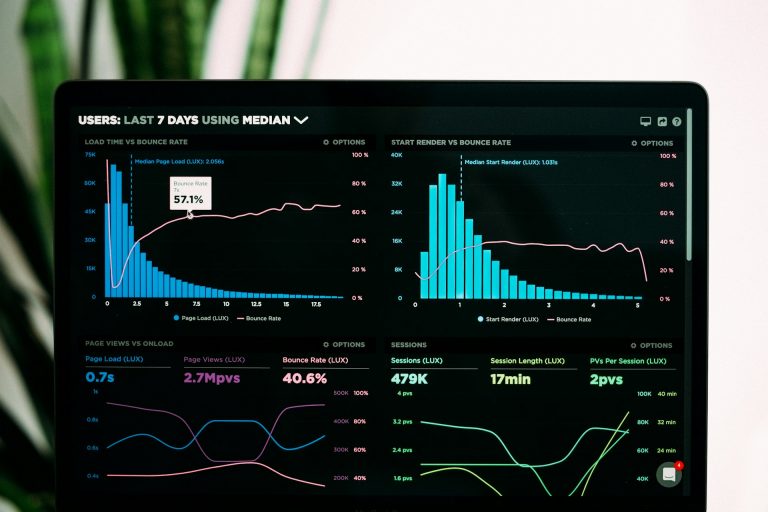
We cannot change the way technology is evolving however, we can surely keep our standards up to the mark. You can use different responsive testing platforms to make sure that your design responds to all screen sizes, viewports, and resolutions. LambdaTest is one such platform where you can test your website’s look and feel across 2000+ device and browser combinations to make sure your website is cross browser compatible and responsive with the latest and the oldest devices. Though there is no way to test on stretchable and foldable screens as of now, but don’t worry technology advances in all directions! We are no far away from wonders happening all around the world in all fields.


