A logo is the central part of any branding effort. This is often the first, and sometimes only, way customers interact with your brand. A poorly designed logo can completely turn off new customers and have a direct effect on how successful your business will be and how people view your brand and services. However, big companies sometimes completely overlook their logo design for some reason. And there’s is no industry where this is truer than online gaming.
But what makes a logo good or bad and how do current popular gaming logos fare up when it comes to logo quality? In this article, we’re going to explore the basic principles of what makes a good logo and we’re going to judge some of the most popular gaming company logos based on these principles.
What Makes a Good or Bad Logo?
The quality of a logo usually comes down to a few principles. The first one is simplicity. A good logo should be simple, but polished. In other words, a good logo should show that there was some effort put behind it, without looking overdrawn. Some of the best and most simple logos also tend to be the most memorable. Which leads us to our next point.
Memorability
A good logo should ultimately be memorable and be engraved in your client’s memory from the first time they see it. This is usually done by using the right colours and appropriate fonts and symbols. Sometimes, the subject matter of the logo is of little importance and some design experts believe memorability to be the single most important aspect of good logo design.
Timelessness
A good logo design should be timeless and be able to stand the test of time. Will the logo still look good 5, 10, 15 or 20 years from now? Many companies completely overhaul their logos from time to time while others kept the same logo since their inception.
Think about Coca Cola as an example. The company have been using the same logo since 1885 while their main competitor, Pepsi, has had over 10 logo changes in the same time period. There is no denying that Coca Cola’s logo is much simpler than Pepsi’s, but also much more memorable and timeless.
Versatility
A good logo design should be usable across platforms without losing its meaning or impact. Will the logo look good in black and white? Can it be miniaturized to look good if printed on something as small as a postage stamp? Will it look good on something as large as a billboard? These are all questions you should ask yourself before you have your logo designed.
Appropriate
Last but not least, a logo has to be appropriate to be efficient. Take fonts, for instance. You wouldn’t use the same font for a children toys store as you would for a law firm would you? The choice of font, colours and symbols should be appropriate for your service and/or industry to be efficient.
Also, it is important to note that a good logo shouldn’t necessarily display what the business is about. A restaurant logo doesn’t have to have food in its logo, and computer related businesses don’t need to showcase computers as part of their logos. As a matter of fact, according to this report, 94% of the biggest brands’ logo don’t show what the business is about. The focus of a good logo design should be identification first and foremost.
Critiquing the Design of Some of the Top Gaming Companies
Now, how do popular gaming site logos fare up as far as logo design go? We examined some of the biggest gaming companies out there and their logos and judged them based on the basic principles of good logo design.
Sun Bingo
Sun Bingo is one of the biggest and most popular gaming sites in the UK. Their logo features the very memorable Sun newspaper logo which automatically adds credibility to the brand. The logo uses a very joyful assortment of colours, and the font and symbol used for the lower half of the logo add a sense of playfulness to the brand, which makes it perfect for a gaming site.
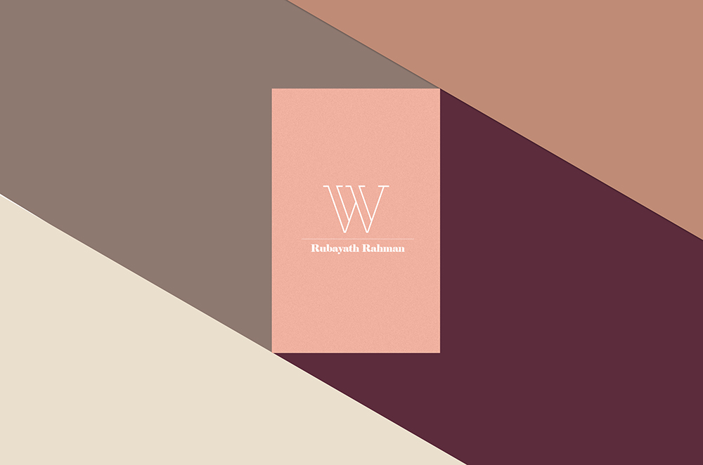
William Hill
William Hill is another very popular gaming site that focuses on live bets and casino games. What’s interesting is that the logo uses a combination of calligraphy and sans serif font in its design. This combination doesn’t always work, but works very well for this logo. The serigraphy part adds a little old time charm to the brand and ties in very well with the site’s casino aspect. The sans serif part, on the other hand, is perfect for any online based brand. The logo is memorable, versatile and clean. It would also look great on a variety of mediums.
Paddy Power
Next comes Paddy Power, another very popular and emerging gambling site focused on online betting. In this case, we have no idea what the designers were thinking. This logo could’ve been created by anybody with even the slightest knowledge of graphic design. The logo showcases the company’s name in bold letters with no variety in fonts or size. Furthermore, the logo is solid white in colour which could be problematic on some mediums. The logo is completely unmemorable and should be completely overhauled in my opinion.
In Conclusion
The study of these three logos should give you a general idea of what makes a good or bad logo design. While simplicity is always good when designing a logo, it should always be memorable and stand out from the pack. This is usually done by using the right assortment of colours and a clean and memorable font.
Also, while the use of symbols isn’t always recommended, they can ultimately make the brand more memorable. You also have to keep in mind how a logo will look across platforms and if it will pass the test of time. If your logo checks all of these categories, you definitely have a winner on your hands.