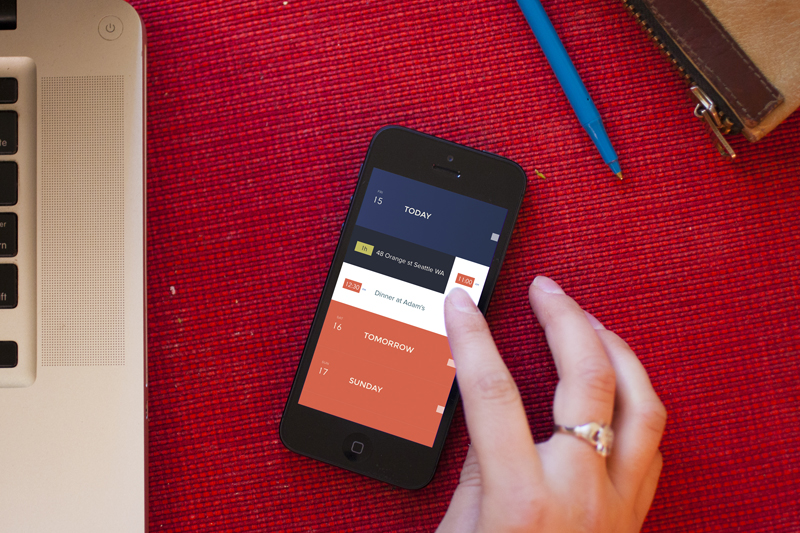
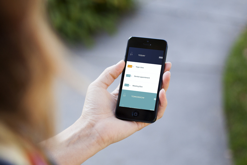
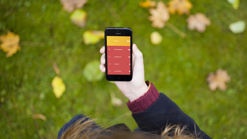
Peak a new calendar app designed with a minimalist approach that’s very simple to use, the app uses unconventional interface that us designer will really appreciate. Peak aims to take the iOS UI paradigm to the next level and cuts away the overwhelming features of mobile calendars, leaving the end users with all the important information that’s easy to understand manner. Other innovative feature for showing the time, simply cup your hand over the top half of the screen, and it shows you the time in a black layer over the calendar. Watch the entire view below
Peak – Minimalistic Calendar App

Tags: AppiOSiPhonePeak - Minimalistic Calendar App
SHARE THIS POST...
YOU MAY ALSO LIKE...
|
Here's an another additional to the Apple devices mock-up, this one is for the iPhone
|
|
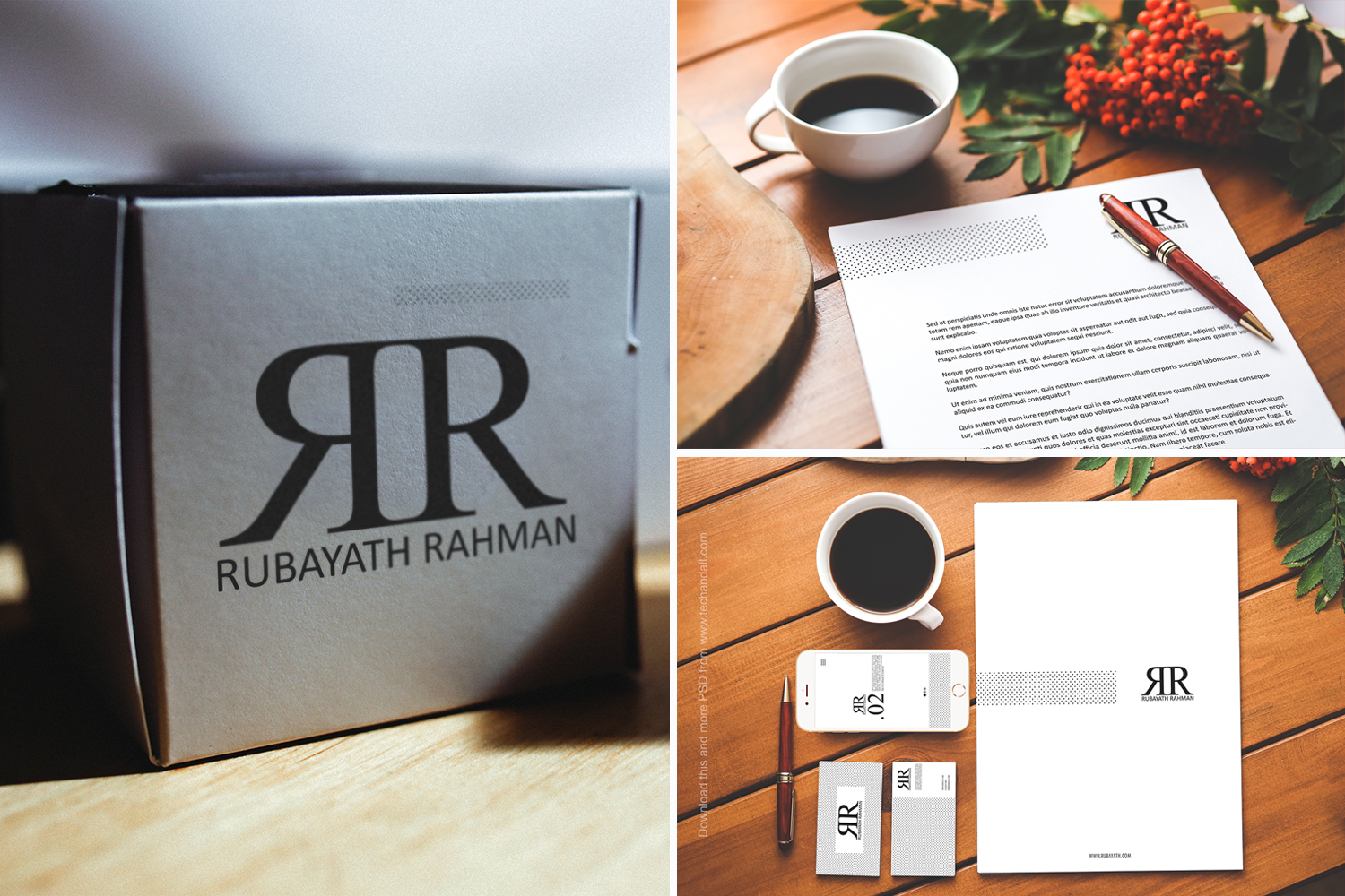
Here's our newest release, the Branding Identity Presentation v.3 that includes business card, letterhead, logo
|
|
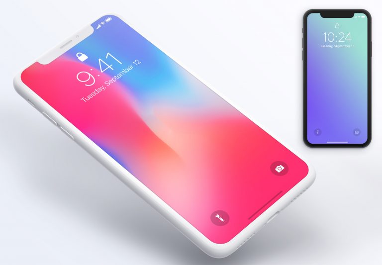
Here's the iPhone X Photoshop mockup available for download from the links below. All PSD
|
|
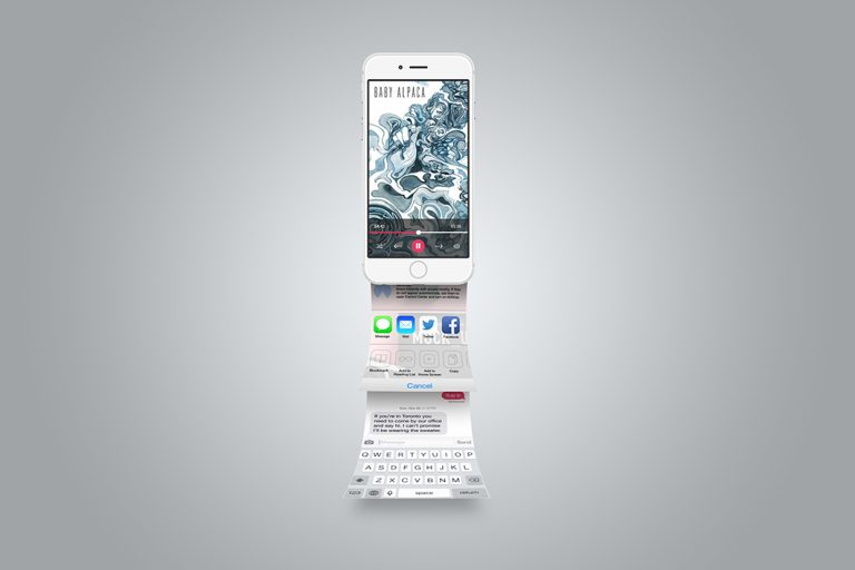
I'm happy announce my newest release, the iPhone 6S Mock ups includes 4 high resolution
|
|
Another amazing by designlazy mock up to show case your iOS app, or the mobile
|

