Your website’s ability to generate leads is primarily based on your landing pages. This is because it’s in your landing pages where you’ll be able to place your lead-capture forms, which allows you to gather contact information, allowing you to build an email list. Hence, without a good landing page, digital marketers or your business, in general, would be limited in converting merely web visitors into leads.
Additionally, a highly attractive landing page allows you to guide visitors to your site, funneling them to their sales journey. This means that having a good landing page is an essential factor in making a sale.
According to an experienced source, a landing page is one crucial factor that affects user experience, which, in turn, affects your site’s conversion rate. However, creating a good landing page is easier said than done. There are plenty of strategies that need to be implemented to craft an efficient landing page.
That being said, here are some tips for you to create a better web landing page:
- Know The Type of Landing Page
First, it’s important to know the goal of your landing page. This is a necessary step since the following tips below will revolve around your objectives.
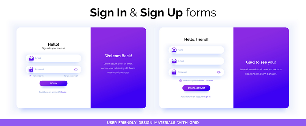
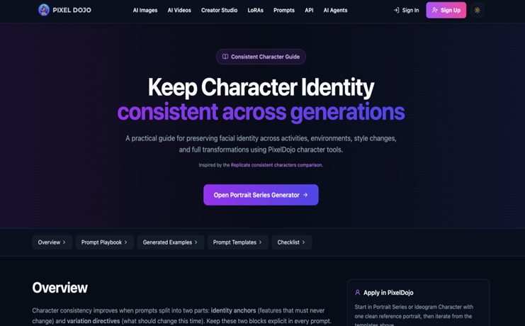
Essentially, you want to have two basic landing pages: a product page and a signup page. The former is where you’ll promote your business as well as persuade visitors to avail of your products or services. Meanwhile, a signup page helps you grow your emailing list, which is helpful if you want to notify loyal customers about your offering or discounts.
Having a well-crafted product page and signup page will promote a seamless user experience; hence it wouldn’t be a hassle for potential customers to navigate through your website.
- Create A Compelling Copy
Just like any digital marketing campaign, like emails, a good landing page will only be effective if it has a thoughtful copy. To create such a landing page, do note that it must be on-brand, succinct, and relevant to your audience. As a tip, don’t try saying 10 words when five would suffice; be direct yet compelling.
Additionally, here are some important elements that a compelling copy should possess:
- Headline: This is important since this is the feature that’ll attract the attention of visitors the moment that they visit your site’s page.
- Body: This is essentially the main content of your copy. As mentioned above, the information contained in the body should be informative, simple, and direct to the point. If possible, utilize bullet points so that you’ll avoid having huge chunks of text, which can be off-putting for some readers.
Furthermore, if you’re promoting a sale, ensure that there’s a sense of urgency so potential leads would want to purchase the products right then and there. On the other hand, if you’re collecting emails or information from visitors, make sure that they know the rationale behind such an action. For instance, you can say something like, ‘Enter your email for future promo updates.’ This way, they won’t hesitate to give you their contact information.
- Call-To-Action (CTA): A good CTA is based on your landing page’s body. For instance, if a user is still reading about your product, you can have a CTA that says ‘learn more.’ This way, visitors would most likely click on it, especially if the body is truly convincing to the point that visitors would love to learn more about your product or services.
Additionally, if you’re already convincing your customers about your product or service, then your CTA should say something like ‘Buy Now.’ Revolving your CTA around the customer’s sales stage has a higher chance of being clicked.
- Choose The Proper Typography
Typography refers to both the font type and size, as well as the proper use of white space. The choice of font and the overall format of your landing page is important since it’ll make the content more comprehensible for the visitor. Hence, even if you’ve crafted really convincing content, it would be futile if visitors won’t read it because your typography is visually unappealing.
- Be Mobile-Friendly
Speaking of the overall style of your landing page, you must consider the fact that potential customers aren’t limited to using their laptops or desktop computers. In fact, most people would love to browse on their mobile phone nowadays, given that it’s much convenient than laptops.
It’s best if customers won’t have to zoom in and out on your signup page just so they can log in. Additionally, there’s a low chance that visitors would click on your CTA if it doesn’t fit their mobile screen. This being said, ensure that your website’s content, most importantly, your landing page, is optimized for mobile use.
Takeaway:
Your landing page plays an important role in converting a mere visitor into a potential lead. Hence, it’s best to have a well-crafted one so you’ll increase your chances of gaining a profit. By following the tips mentioned above, you’re on your way to creating better web landing pages for your site.


