Open almost any free UI kit and you will find the same habits. Labels sit at 12 or 14 pixels. Secondary text is light gray on white. Icons are thin outlines with no words beside them. Those choices look clean in a mockup, and they quietly lock out a large group of users over 65.
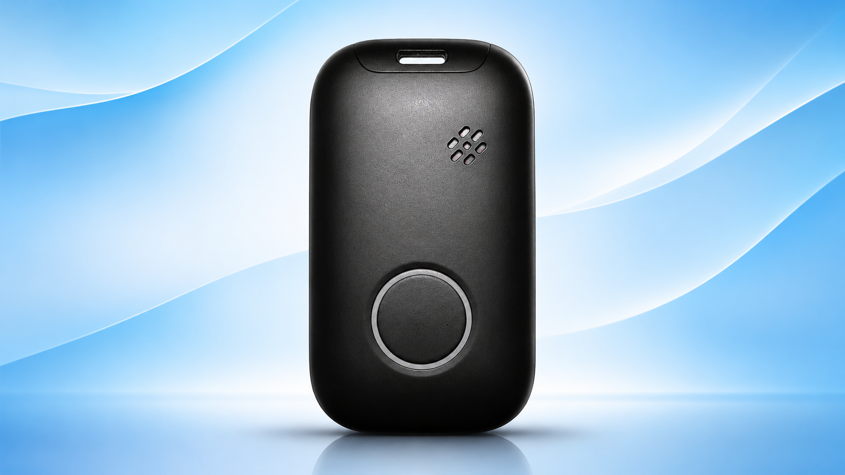
Image courtesy of Life Assure
Alt text: Front view of a black mobile alert device with a large round button, a small speaker grille and a charging port on top
One useful case study comes from a medical alert provider at lifeassure.com, whose mobile GPS device puts emergency help behind a single round button. Life Assure is a Canadian company, and its monitoring service is available to customers in Canada only. The product is not sold in the US, but its design logic travels anywhere.
Why Is a Single Button Such a Hard Design Brief?
A single-purpose device is a product built around one task, with nothing else competing for attention. That sounds simple. In practice, it removes every crutch a designer normally leans on.
There is no screen to explain what happened. There is no menu to undo a mistake. The device has to communicate through shape, touch and sound alone.
Life Assure’s mobile unit shows how those constraints get solved:
- One large round button framed by a contrasting ring, so a thumb finds it without looking.
- Two-way voice through a built-in speaker, so the confirmation is a human voice rather than a status icon.
- A water-resistant shell that lets the wearer keep it on while bathing.
- GPS location on a cellular network, so help can find the wearer away from home.
A press connects the wearer to Medical Alert Specialists who monitor around the clock. GPS lets responders find the wearer even when they cannot describe where they are. The interface is the conversation.
What Does Low Vision Change About Type and Color?
Most screen interfaces cannot rely on voice alone, so the next lesson is visual. WebAIM explains that low vision covers conditions like macular degeneration, glaucoma and cataracts, and each one breaks a layout in a different way. Small text that does not enlarge well, or text with low contrast, may simply disappear.
Cataracts make text hard to separate from its background, especially in bright light. Glaucoma narrows the field of view. Macular degeneration blurs the center, which is exactly where most designers put the key message.
Practical type and color rules for older users:
- Set body text at 18 pixels or larger, and let it scale with system settings.
- Aim for at least 4.5:1 contrast for normal text, and higher for critical status.
- Use a regular or medium weight. Hairline fonts fade on aging screens and eyes.
- Never place text over a photo without a solid backing panel.
- Pair every color signal with a word, since red and green alone are easy to miss.
Dark themes need their own pass. Pure white text on pure black can glow and blur for people with cataracts. A soft off-white on a deep charcoal is usually easier to read. Check both themes with real users, not only with a contrast tool.
How Big Should a Tap Target Be for Older Hands?
Arthritis, tremor and dry fingertips all make small targets miss. A 32 pixel icon that works for a 25 year old turns into a frustrating game for a 78 year old.
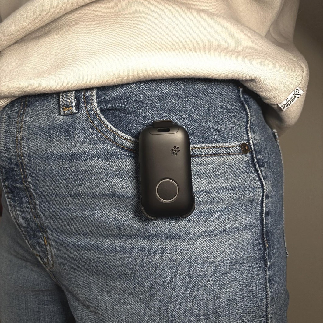
Image courtesy of Life Assure
Alt text: Black mobile alert device in a belt clip on the waistband of blue jeans, worn under a cream sweatshirt
The U.S. Web Design System describes a button as an action with a large selectable surface. It also asks for short labels that start with a verb. Both rules matter twice as much for senior users.
Spacing is the hidden half of the problem. Generous gutters stop neighboring targets from catching a shaky tap. The Tech & ALL primer on grid systems makes the same point about gaps that stop elements touching.
A safe baseline is a tap area of at least 48 by 48 pixels, with 8 or more pixels between targets. For an emergency action, go far bigger and give it its own row.
What Should a GPS Tracker Companion App Show First?
Trackers like this one also serve a second audience: family. The Life Assure GPS page describes real-time location tracking and customizable alerts as part of the appeal. That points to the adult child checking in on a phone.
Design that dashboard for a glance, not a session. The most useful order is usually:
- Current location as a plain street address, not only a map pin.
- Battery level in large numerals with a word label.
- The last time the device checked in.
- Any alert in the past 24 hours, at the top and in a contrasting panel.
Wearable design is moving the same way. A Tech & ALL roundup of AI wearables worth trying praises devices that stay out of the way until needed. Senior products should follow that rule more strictly than anything else.
How Do You Test a Senior Interface Before Launch?
Design reviews by 30 year olds on retina monitors will miss most problems. Bring in at least 5 testers over 70, and watch rather than ask.
Useful test conditions include bright window light, reading glasses removed, and cold hands. Time how long the main task takes. If a tester hesitates for more than 3 seconds on a primary button, the label or size is wrong.
Then test the failure path by staging a mistaken press on purpose. A good senior design makes the mistake easy to cancel and impossible to ignore.
Frequently Asked Questions
What Font Size Works Best for Older Users?
Start at 18 pixels for body text and support system text scaling. Headings and critical labels should be larger still.
Is a Screen Always Better Than a Physical Button?
No. For an emergency action, a physical button with voice feedback is faster and more reliable than any touchscreen flow.
Can Life Assure’s GPS Device Be Used Outside Canada?
No. The monitoring behind it is limited to people living in Canada. Designers elsewhere can still borrow the hardware thinking for their own projects.
How Many Older Testers Do You Need?
Five testers over 70 will expose most major usability problems. Add more if the product serves people with specific conditions such as dementia.