A new report says Apple’s next version of its iOS will look very different from previous iterations, though stay largely the same
It’s no secret Apple plans to show off the next major version of iOS at its annual developers conference in June, though what exactly will be different about the new software has been fuzzy.
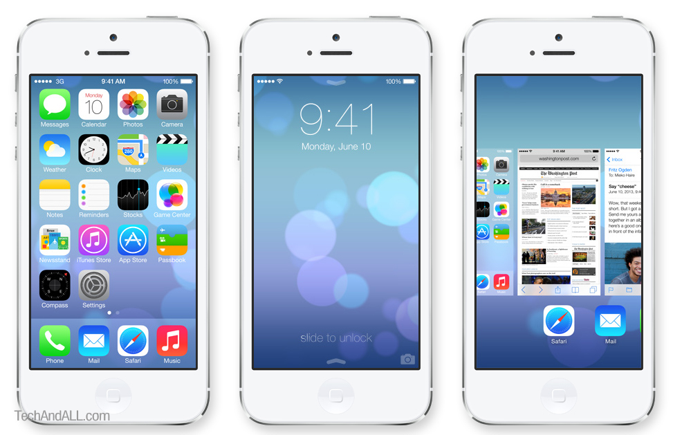
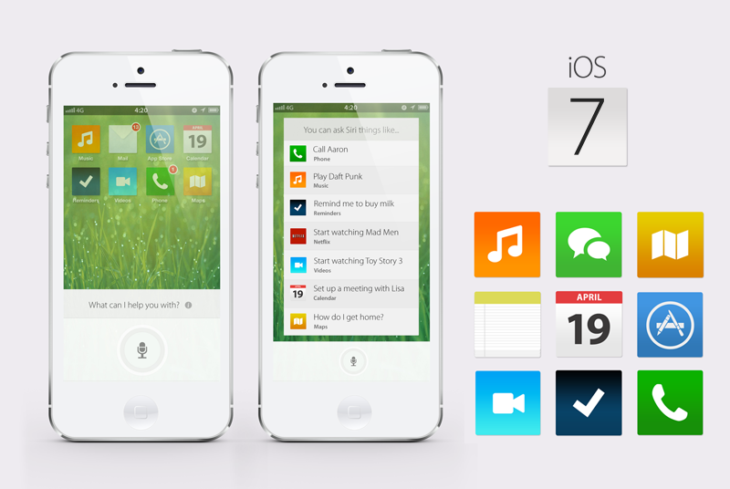
Citing multiple people who have actually seen Apple’s next iOS endeavor, 9to5Mac says Apple’s making big changes in the look and feel of the software. Specifically making everything — from app icons to interface features — “very flat,” as opposed to the bubbly and oftentimes realistic interfaces that have stayed mostly unchanged since 2007.
On top of this, the report adds that Apple is looking into additional ways to access basic information with gestures, similar to what it currently uses with a one-finger swipe to bring up Notification Center, and a four-finger swipe on the iPad to pull up the multitasking menu.
Design changes are nothing new when it comes to Apple software. OS X in particular, has undergone major revamps every few years. That includes a storied history of pinstripes, brushed metal, and glassy windows, which — at various points in the last few years — could be seen right next to one another in different apps, in the same major release. iOS, on the other hand, has seen plenty of changes in interface elements, but not the look and feel of the home screen itself.
Apple is viewed as being at a point of transition when it comes to its own design. The company reshuffled its top management last October, ousting iOS software chief Scott Forstall, and putting both iOS and Mac software under the guidance of former Mac software chief Craig Federighi. Those moves were underscored with hardware designer Jony Ive taking on “leadership and direction for Human Interface” across all of Apple. A report last month claimed the industrial design and software teams were already working more closely, as a result.
In taking a flat approach to its system software, Apple would join Microsoft and Google, which have gone that route with their Windows Phone and Android software. In both of those cases, the changes reflect part of a larger design language that can be found in other products and services.
Via CNet

